Pages

Wednesday, December 7, 2011

My Christmas Crayons

 We're all busy coloring our house with Christmas and I'm no exception.  We put up six trees; five artificial and one live.  I'm only showing three today as the other three are in each of the kids' rooms and they are not fit for public viewing.  First up, the "Fir in the Foyer."  I only wish pictures could capture the beauty of these trees.  Maybe it's the photographer, but they just look so much more lovely and sparkly in person.  I decorate this tree with prisms and ornaments made from crystal, glass, silver colors, and gold colors so they are all sparkly and refract the lights. 


Many of the ornaments on this tree were selected for their iridescence or brilliance, but several have special meaning, including the little couple in the gift box just below.  It is a "First Christmas Together" ornament by Enesco Precious Moments given to us by my mother the first year we celebrated Christmas as a married couple in 1987. It's "precious."  Our family room tree coming up below has all the other "precious" ornaments.


I  love these sparkly white swans - - a mama and her three babes - - just like in our house.  I couldn't find their Daddy, unfortunately.  Usually one of our kitties is sleeping under the tree, filling in for the missing Daddy.  Things are a bit more rosy for my three babes.  The kitties don't have to step up.


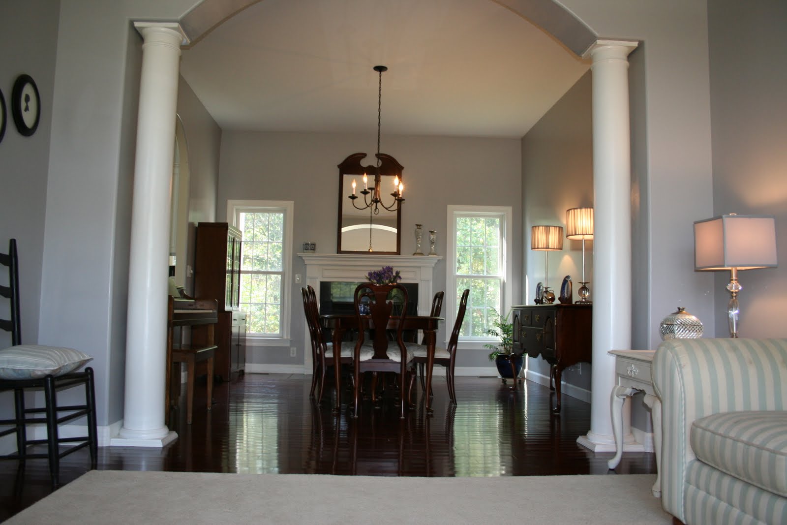
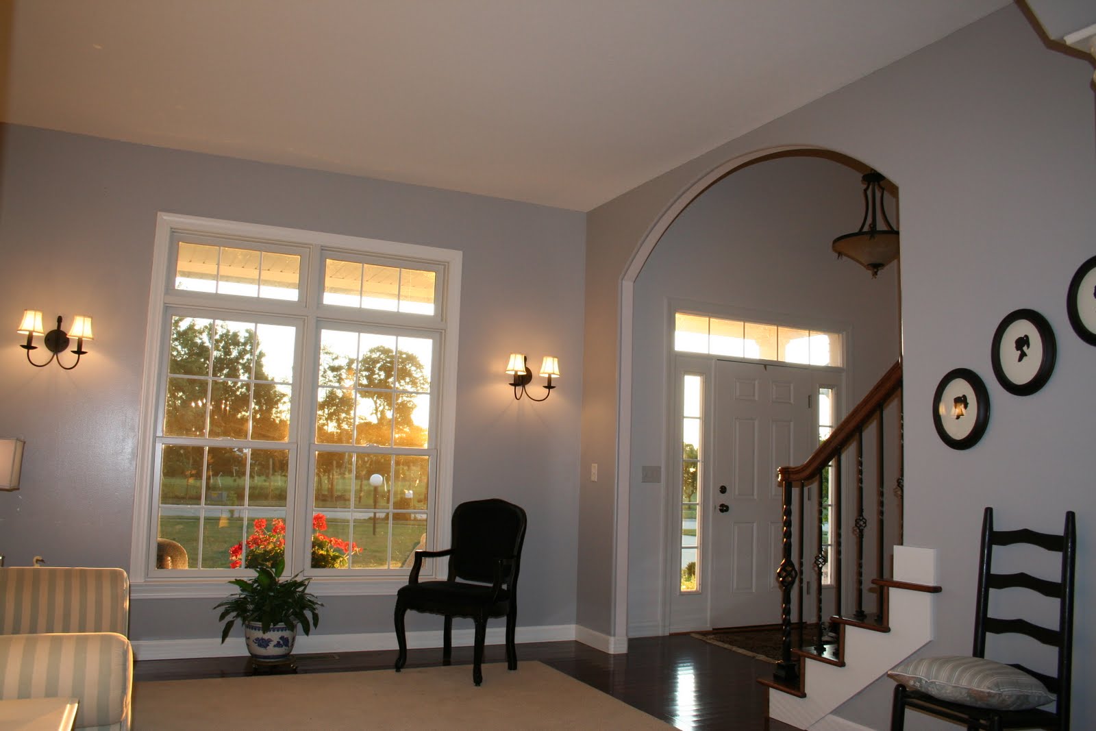
I recently painted the formal living room and dining room a grayish/silver color (metamorphosis post here) and am loving the lighter, more sophisticated look of the rooms.  I'm able to pair the new color with purple this Christmas season, a seldom used color from my crayon box. 


The dining room


I am enjoying the new bright color on the walls in these two rooms with the purple as the accent.


I have some work to do in this hutch.  Since I only recently painted, I'm still enjoying the Blue Willow against the new back drop and have been procrastinating about changing it out for the Spode Christmas Tree china.  But, I'll do that soon as I really enjoy seeing and using those dishes too, and having the opportunity one month a year isn't quite enough.

Gold and silver balls in different sizes add a simple touch above the windows in the kitchen.

I'm not thrilled with the way the sideboard in the kitchen turned out, but I needed a place for the nativity.  I have to work on this space so that it makes more of a statement. Then I need to take a better picture. I just read a post at Centsational Girl about photography basics for bloggers. For any of you who are new/inexperienced like me at taking pics for a blog, I urge you to spend a few minutes reading it here.

This more traditionally decorated live tree in the family room.  This is my favorite tree as it has all the ornaments we've collected over the years either as gifts from people who mean so much to us, some from places we've traveled, some made by sweet chubby little fingers when the kids were small, and the list goes on.  Every ornament has a special meaning.  There is the angel I found when shopping at antique stores with my daughter, the ornament that matches my blue willow my Mom gave me from her trip to George Washington's estate at Mt. Vernon, ornaments from my Grandmother's estate, and many many others with unique, special meaning.  I know that all of you have the same ornaments.


The mantel in the family room has my collection of Santas.

And that it is for now.  I'll be back with the nutcracker collection, a Spode Christmas Tree tablescape and, hopefully, an enhanced nativity display.
Merry Christmas.

Purple Passion

I'm so excited to join the 12 Days of Holiday Projects for Blue and Purple since I just updated my dining room and formal living room from red to shades of blue and purple and have been able to decorate with purple this season.  


It was, however, with great trepidation, hesitation, and doubt that I painted over the red walls as I loved them, especially at Christmas as viewed below in a picture from Christmas last year.  The metamorphosis is at this post.


But, I am having so much fun decorating with purples this year and they look super against the new backdrop of blue/gray walls that I hardly miss the red at all.  It just feels so fresh and updated.
On the sideboard I mixed three purple sparkly cone trees with old pieces of silver we received the first couple of Christmases after we were married many years ago.  I like the tarnished, aged, look and haven't polished them in years.  I think it softens the more modern feel the rooms have taken on since I painted them and since I am traditional at heart, it's a blend of old and new for me.


I've intentionally kept it simple this year to emphasize the elements that really make the statement.  As such, you will notice there are no candles on my candlesticks and very little adorning the mantel in this room.

Another image of the fireplace and you can see how the mirrored candlesticks and lidded trinket box reflect the lights throughout the area.  They also catch and reflect the sunlight in the mornings when it is so peaceful and pleasant in these two rooms.

I've kept it simple in the adjoining living room too and used shades of purple to contrast the walls. 


Forgive the photography.  My skills aren't great to begin with and with all these mirrored surfaces, it's hard not to get a glare.


.
I was so happy to find these pillows that look great with the Christmas decorations, but will look good all year too.  Now I just need to find the right window treatments. THAT is going to be a challenge for me. Window treatments always feel like such a permanent investment and I just don't trust my decorating skills enough to single handidly take the plunge.


Joining the party at Twelve Days of Holiday Projects: Blue/Purple here.

and

Between Naps on the Porch Metamorphosis Monday party


and No Minimalist Here Holiday Dining Party here where there's also a fab giveaway.


Saturday, November 26, 2011

Dining Re-re-re-do. Goodbye Red.

Isn't it funny how one's style can change so drastically in just a few short years. Or, in my case, one can ACQUIRE a sense of style. Absorbed, no doubt, from looking at all your beautiful blogs. When we built our home, I LOVED red.  At the time, updating furnishings and investing in window treatments wasn't an option.  So I slipcovered and decorated with what I had on hand. Nonetheless, these rooms felt "done" to me and I loved the space. Looking back, I can't believe I didn't have a better sense of scale, design, decorating.  I mean seriously, I put lamps under wall sconces.  Can you say unsophisticated.

Looking from dining to living where the living space is painted a shade of seafoam green.


Eventually, I painted the living space red to match. Even though we extended the dining space for Thanksgiving, in the picture below, it is the formal living room.  Actually, the room started out yellow when we were under construction as I thought red and yellow would create a warm, unified space.  Unfortunately, I picked the wrong color of yellow and instead of a golden color, it looked like mustard and ketchup.  So, right before we moved in I hastily picked a different color, still thinking both spaces needed to be different colors.  Not afraid of paint, I also painted the Dollar General lamp shades red and the oak end tables white.
One more image from the first year in the new house. These rooms should have been the same color all along.  They are too connected to be different colors.

And the new, updated color.  It's an accidental custom mix of blue, gray and black.  After eight trips to Home Depot to adjust the color and nearly an entire wall painted with sample colors, I finally found a perfect shade. I also got lucky on a mad dash to TJ Maxx and found two buffet lamps and two table lamps with perfectly coordinated shades (still wrapped in cellophane below).  The rooms really do match; it's just the sun creating the illusion they do not. 
That red couch is like fingernails on a chalkboard now.  Thankfully, I ordered a replacement and don't have to slipcover that couch again so the red slipcover soon disappears, forever. (There are just certain items one can ceremoniously pitch.) You can see I was playing with the dishes on the mantle before the last coat of paint was applied. 
I added this picture to show you how the mirrored candlesticks reflect across the rooms in the morning sun.  It is so pleasant in here in the morning.


While we were painting I kept trying to decide on an accent color.  I glanced out the open window and noticed the lavender flowers blowing in the wind and knew immediately they were trying to get my attention.     


 The nearly finished rooms. 


The only thing missing is the new couch (check) and a little sumptin sumptin for the top of the china cabinet (check).


Now I know a dining room isn't the most ideal place for a piano, but there is no other place in my house for it.  And, I just couldn't bear to cover any part of the window in the living room any longer.


The paint doesn't look purple or blue.  It's grayish-silver.  The Blue Willow may cause the blue hues to pull through.  In any event, I love the backdrop it creates for the Willow.  It's hard to pair Blue Willow with anything that doesn't look good though.  I pulled out the fake iris just to see how purple looks in the space.


I know the wall between the lamps seems bare, but it is so pretty, especially at night.  The only thing I can come up with would be three stacked mirrors, but there are so many mirrors in the vicinity that I can't imagine adding more.  I did straighten the lamp shade by the way.


Looking back into the living room in the early morning.  You can see why I don't want the piano sitting in front of the window.  Again, new couch coming.  Getting a wing back recovered to complement.  But my conundrum - - window treatments.  After living treatment-less for five years, the ones that went up less than a year ago, had to come down.  THAT is why I hate making a commitment to window treatments.  I change my mind so often.


Again, this furniture is temporary.


And with the new settee 


<><><><><><><><><><><><><>
Wouldn't mirrored end tables be great?  Courtesy of cyber Monday and Overstock's free shipping, they are on their way.


<><><><><><><><><><><><><>Below is a picture from Christmas last year.  I had finally picked out window treatments just a month earlier.  I did love the red, especially at Christmas. But now, red and I have broken up and shades of gray and I are going steady.

Thanksgiving a couple days ago.

A nice complement for harvest colors too.


Yes, it's tight - - but so much fun.  I think Grandma approves.


Joining the following parties:

Metamorphosis Monday at Between Naps on the Porch


 DebbieDoos Newbie Party
 
 
Ivy and Elephants
Ivy and Elephants
 
Savvy Southern Style Wow us Wednesdays
 
Photobucket
 
Beneath My Heart "Best DIY Projects of November
 
beneath my heart